Event Brand Identity | Website | Brand Design
Event Communications is Europe’s leading exhibition design company specialising in Museum Exhibition / Attraction design. Their identity and website was ‘tired’ and did not reflect their position in the sector as arguably the leading experts in exhibition design and strategy.
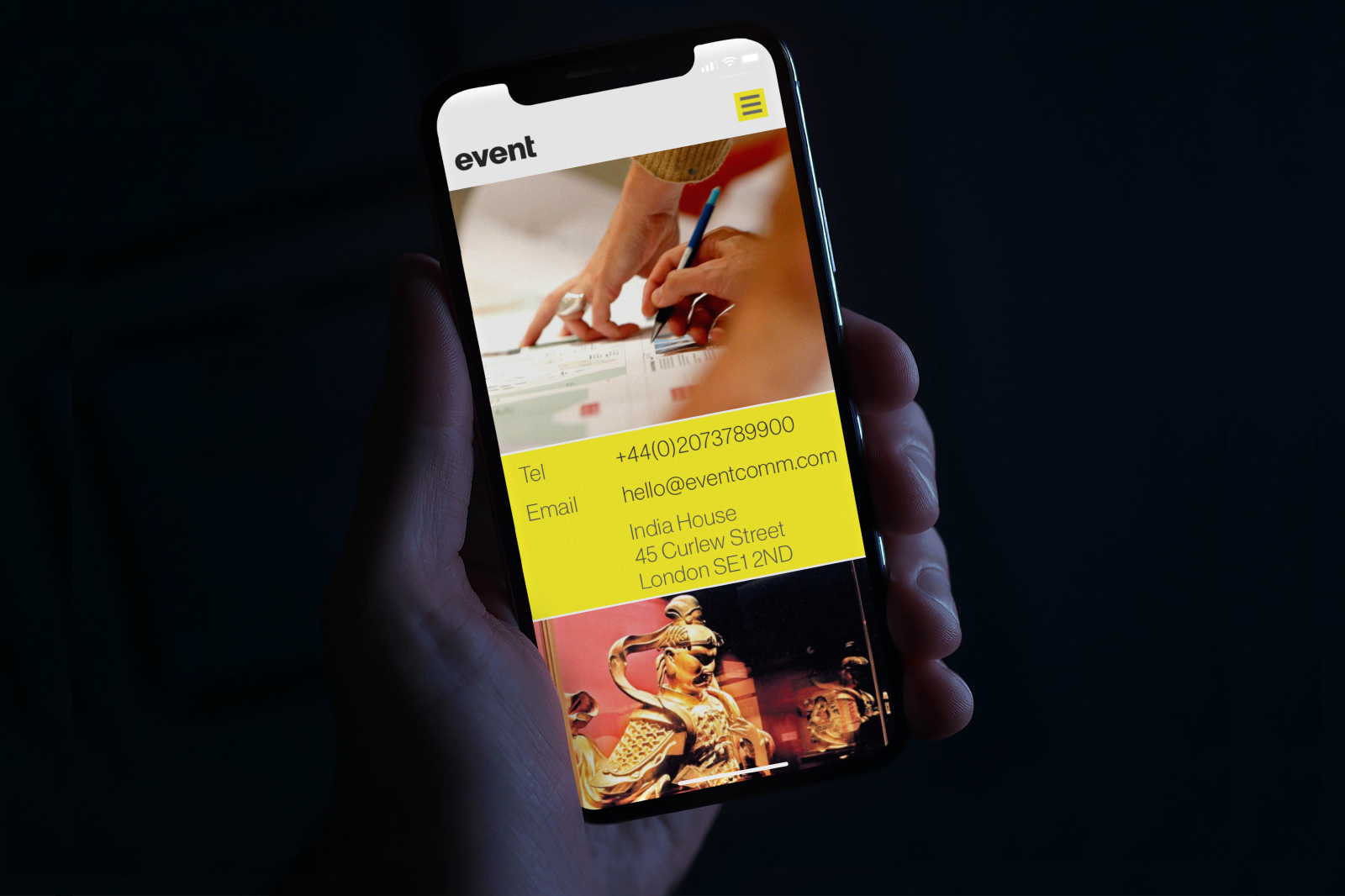
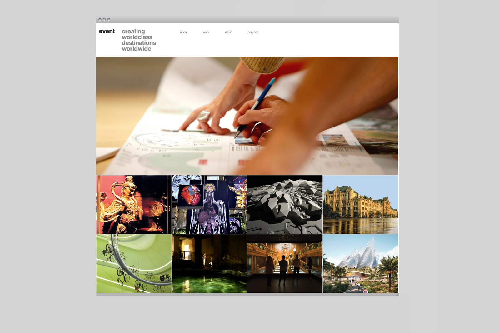
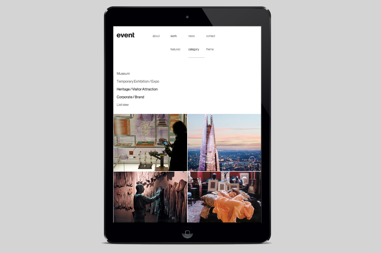
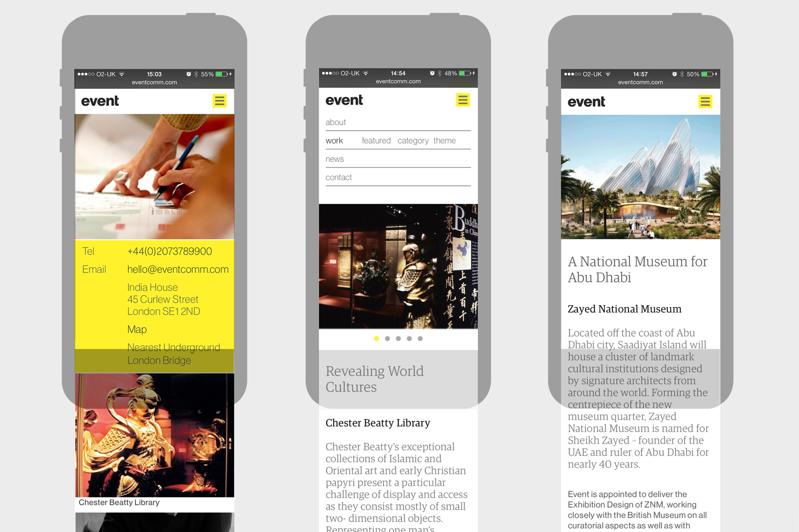
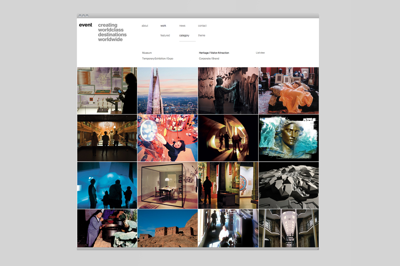
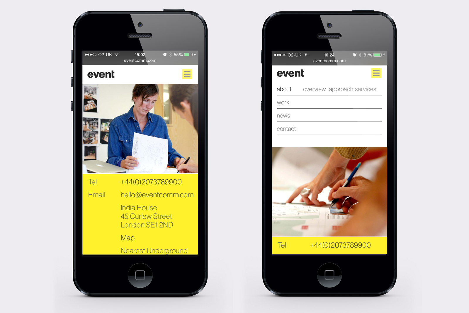
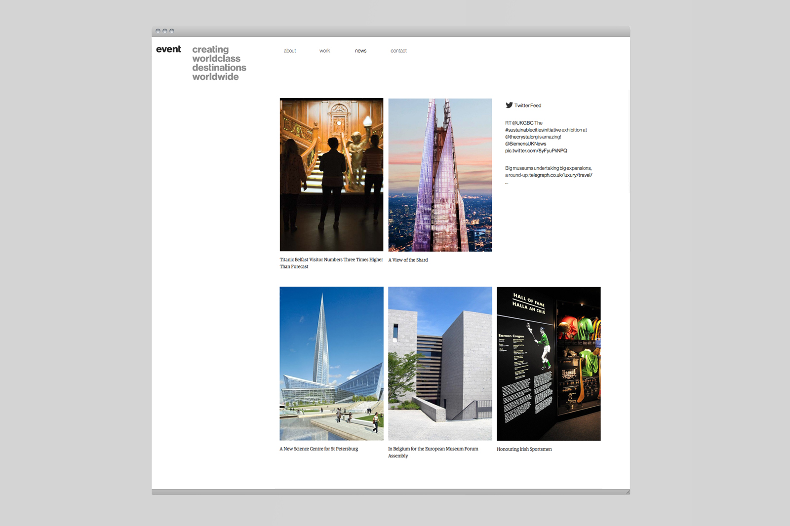
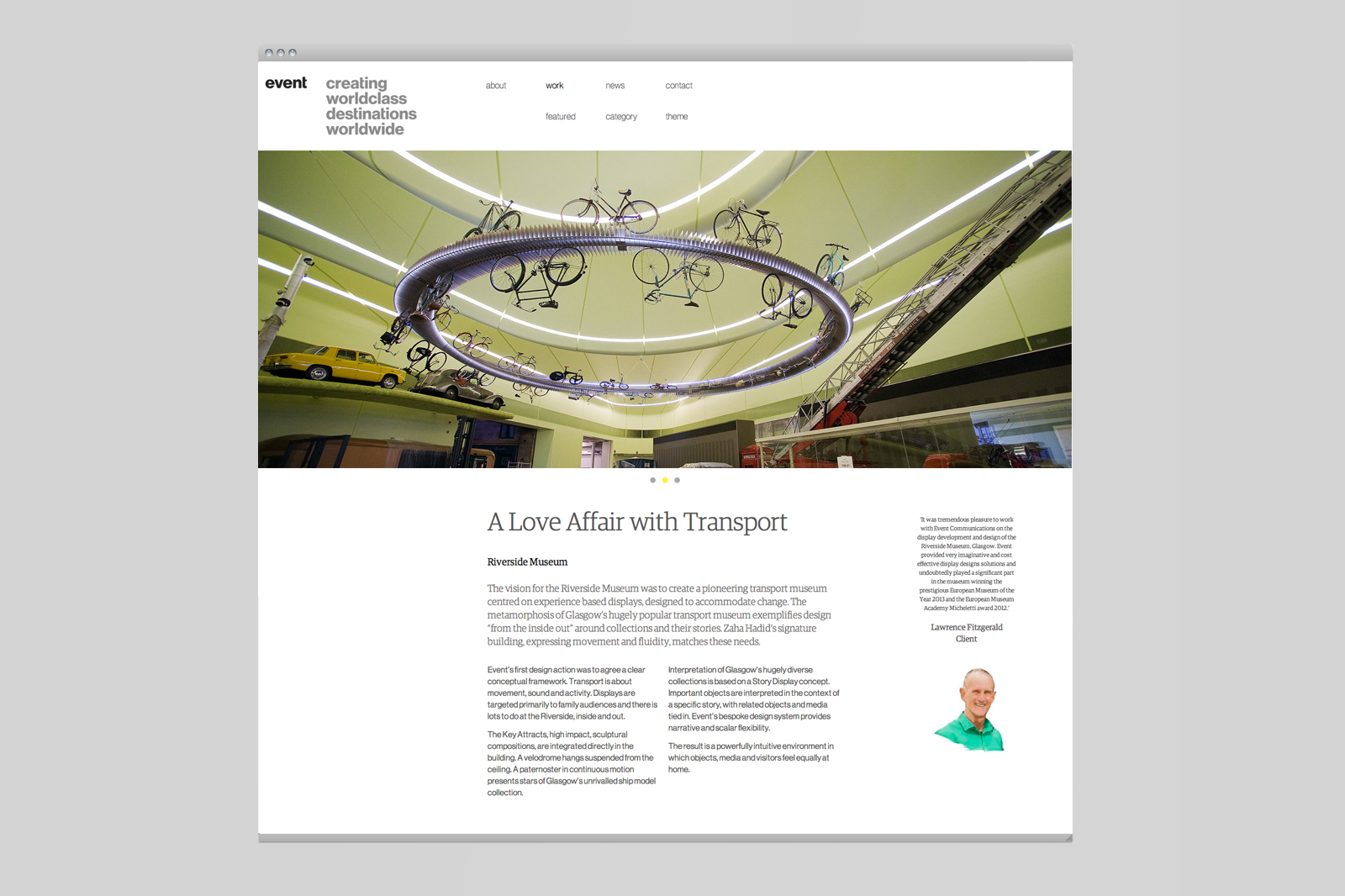
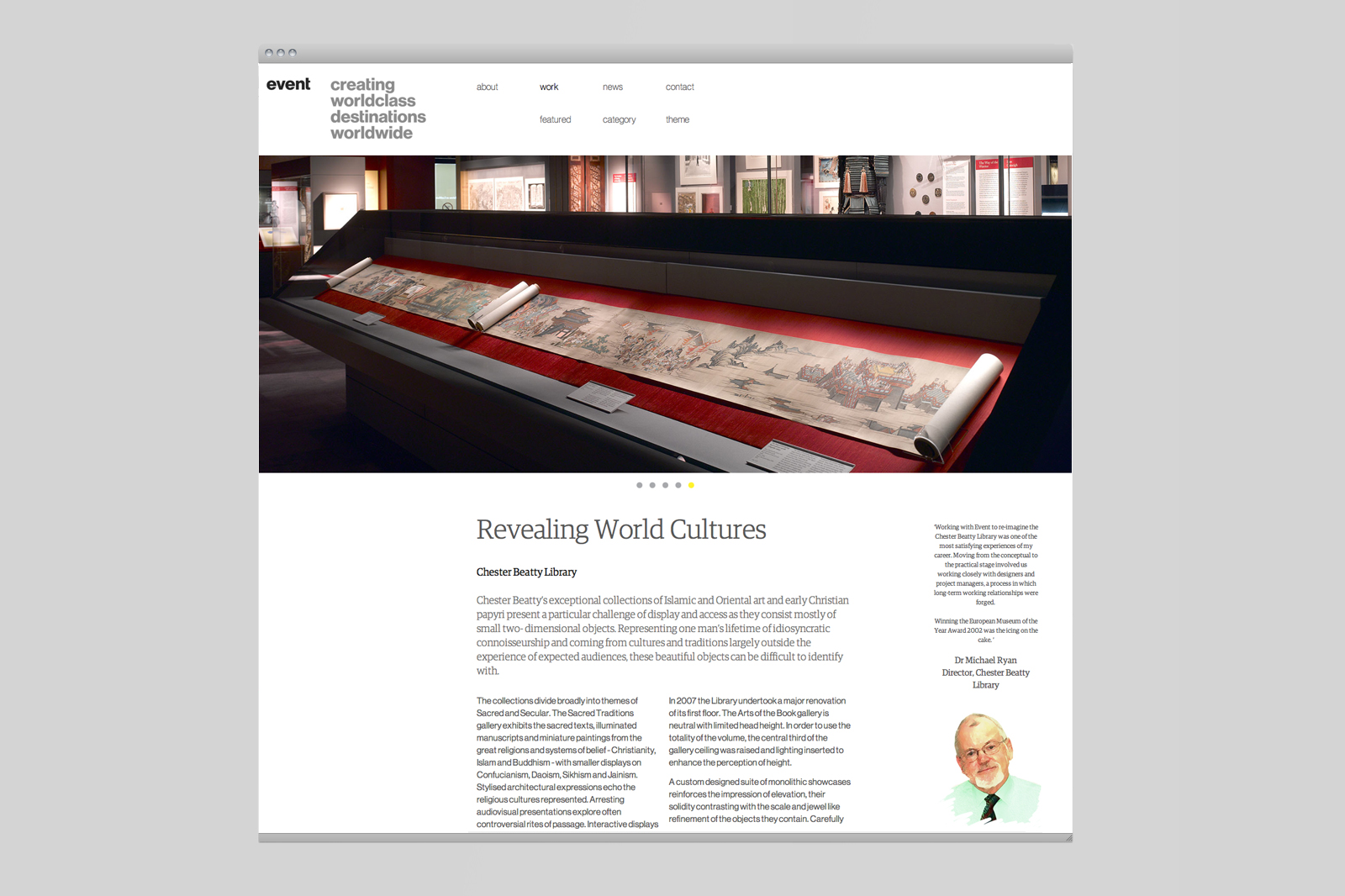
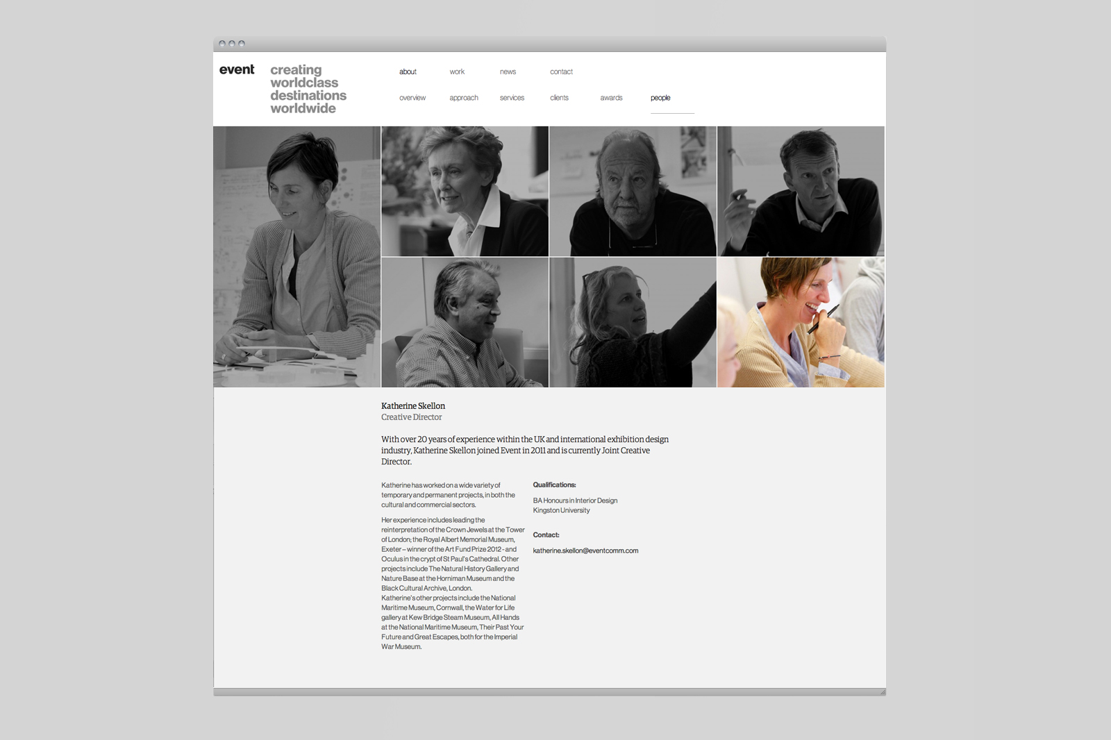
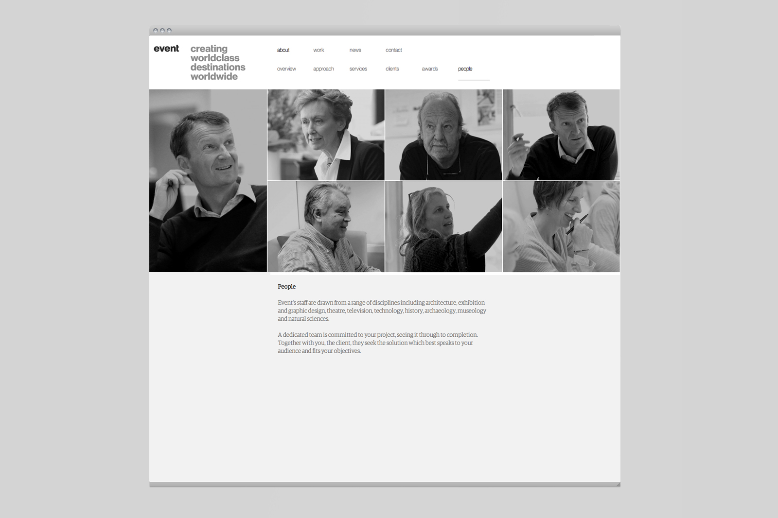
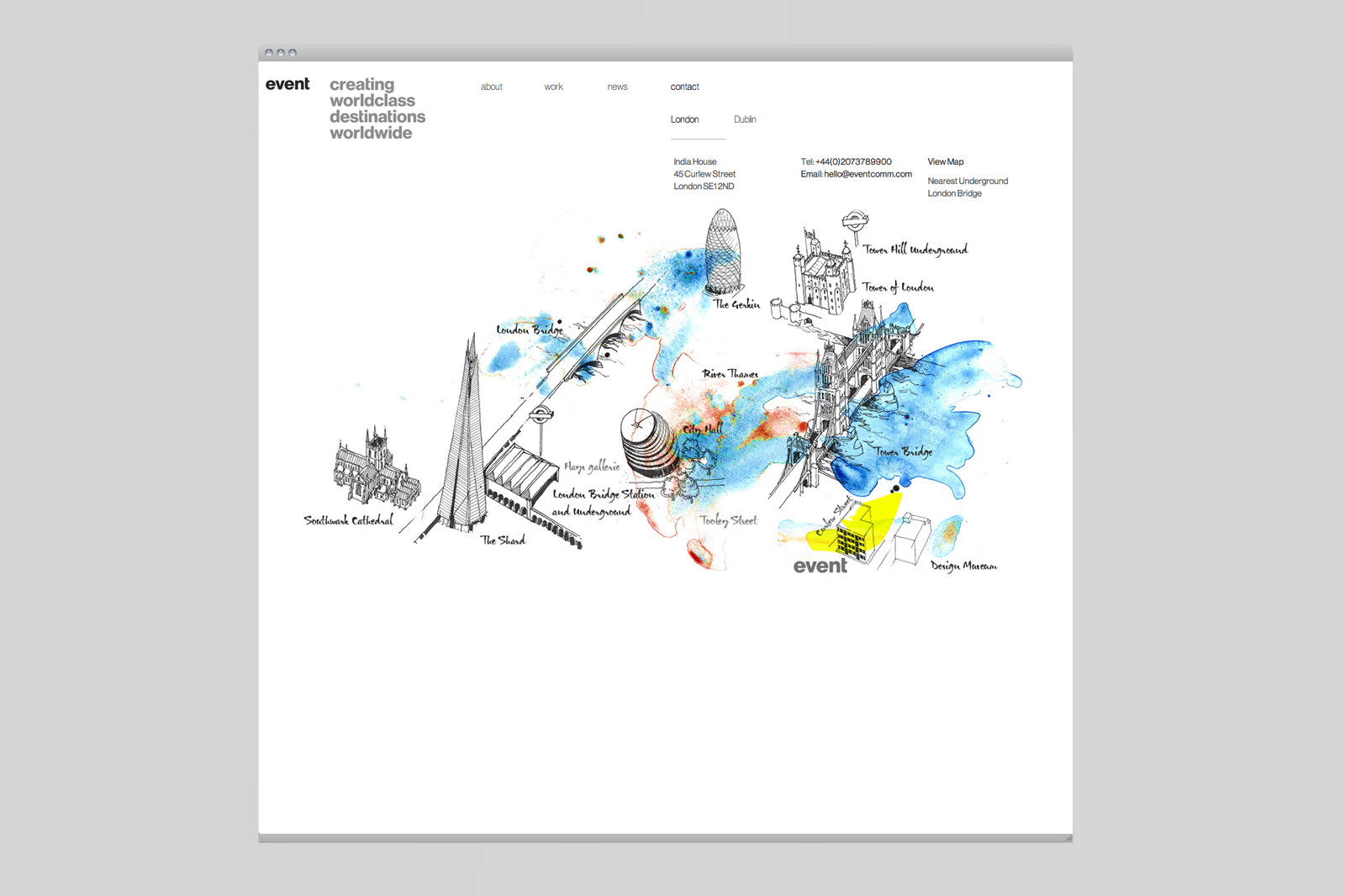
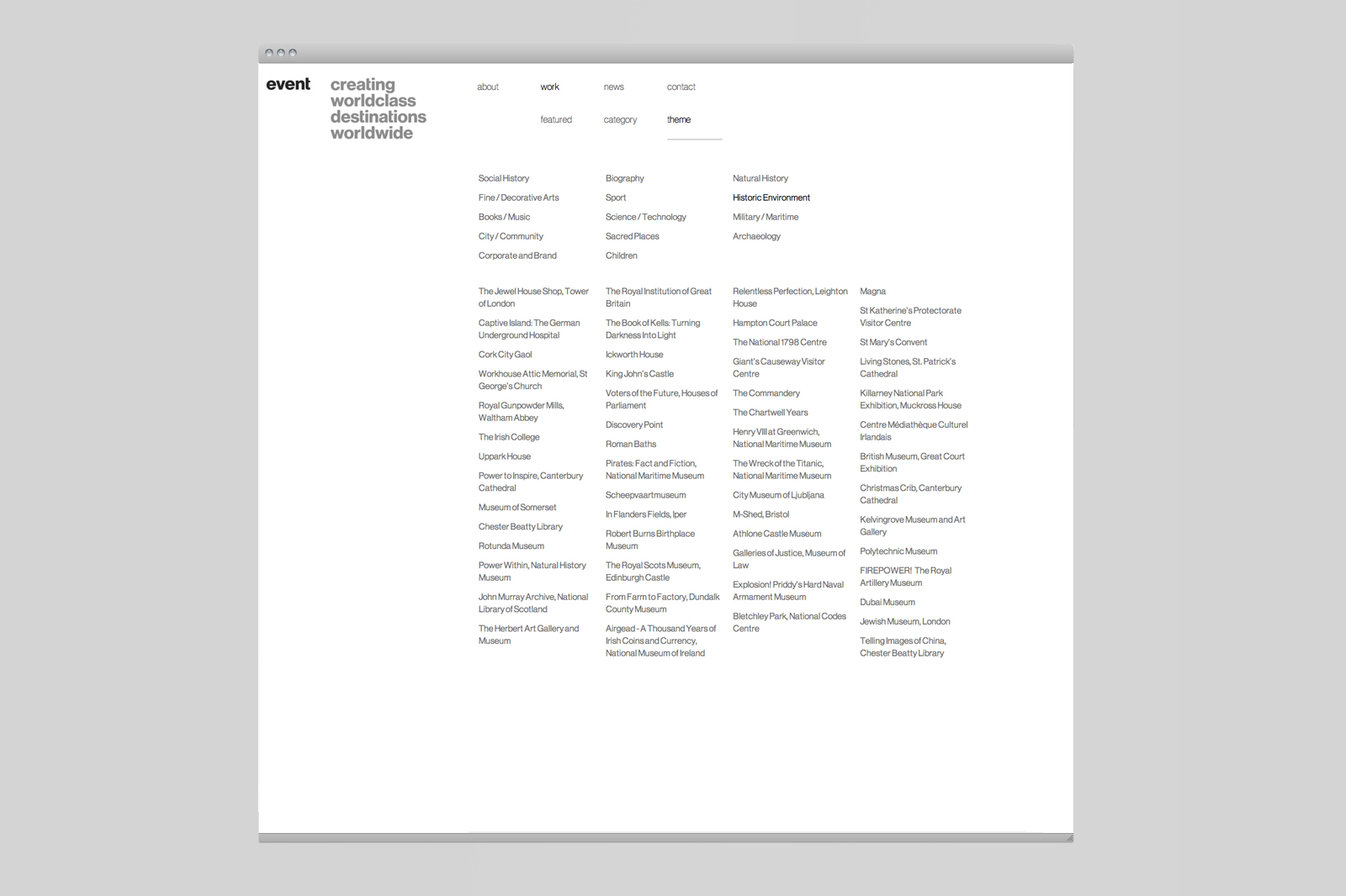
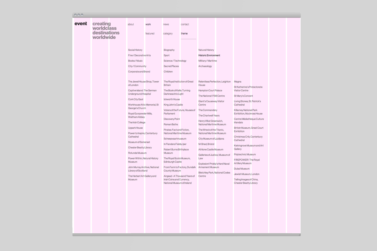
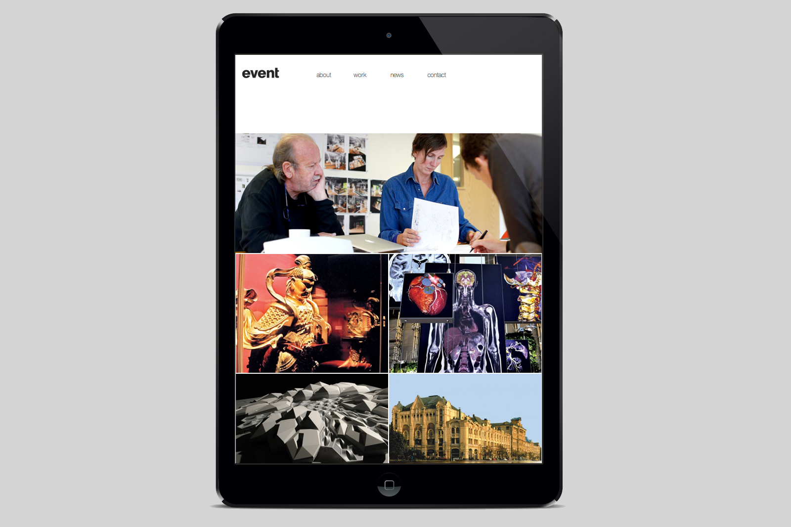
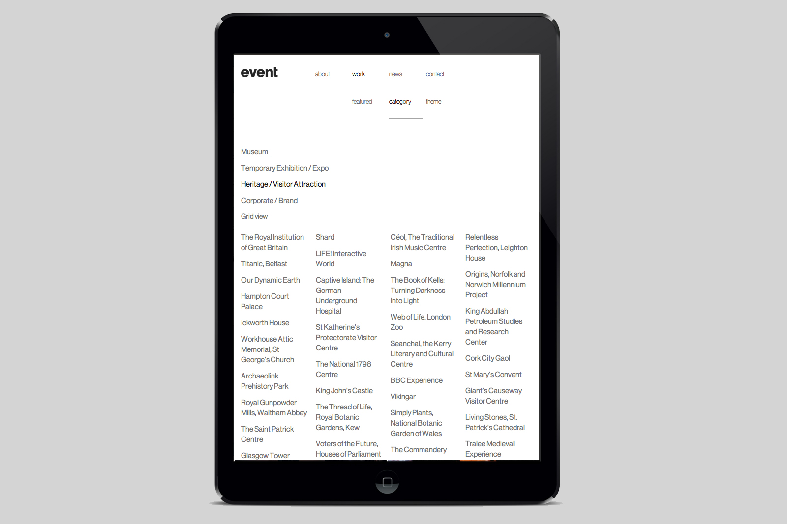
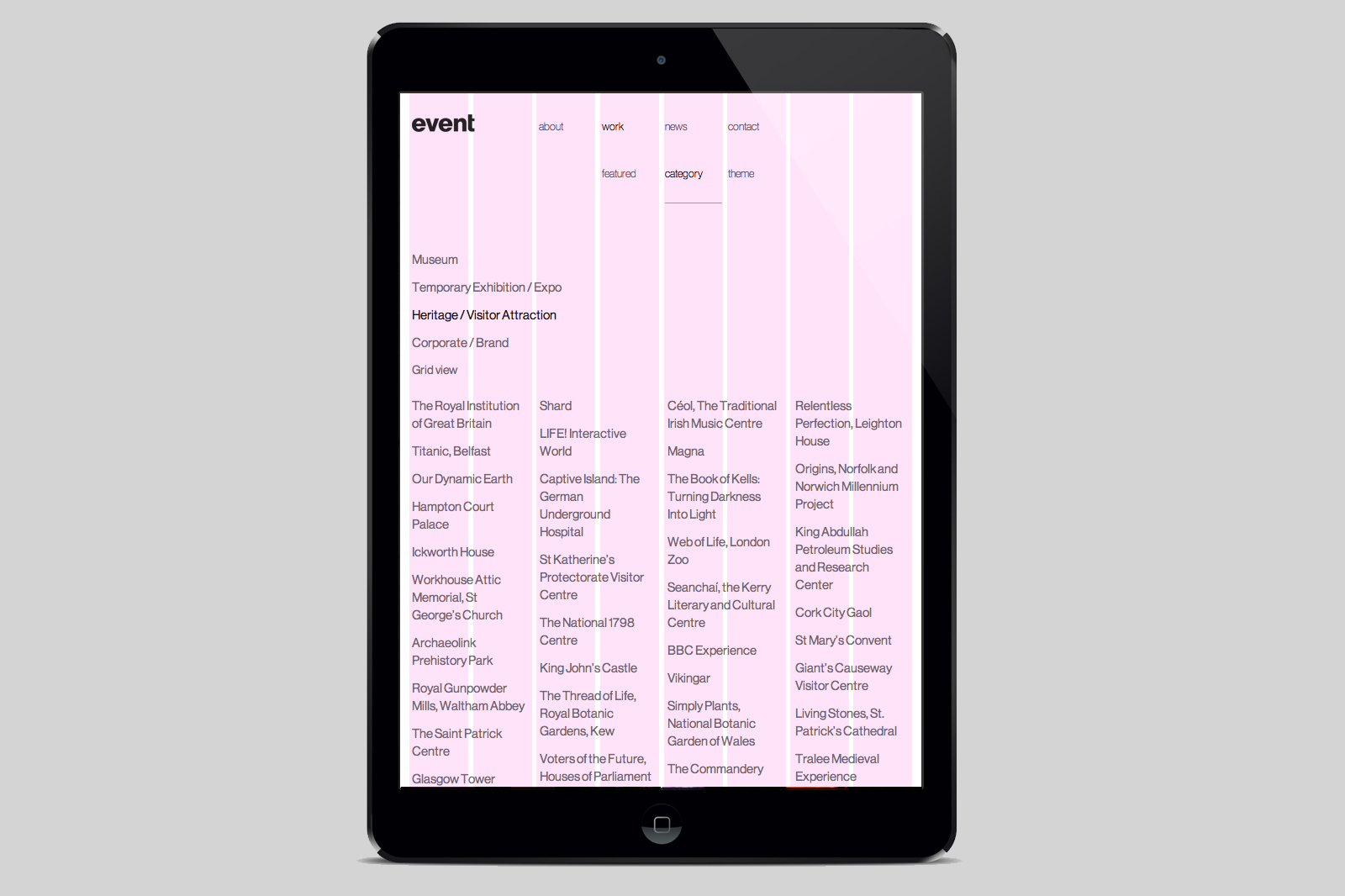
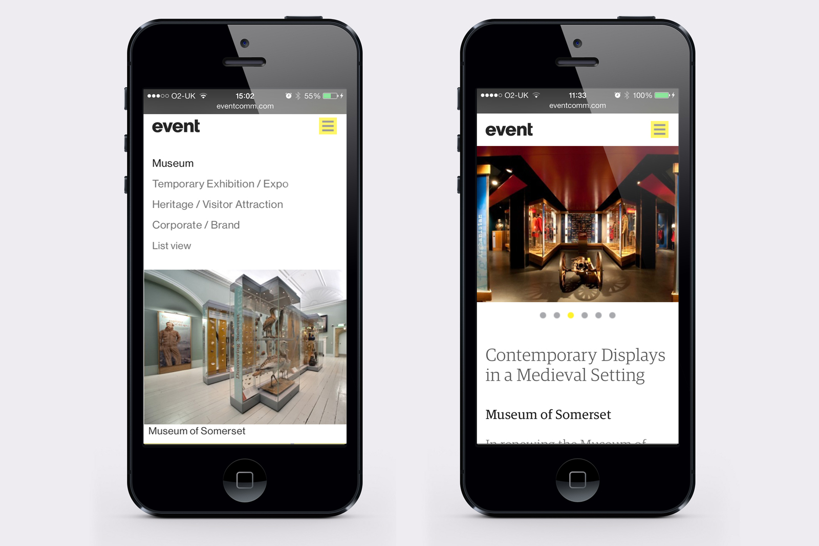
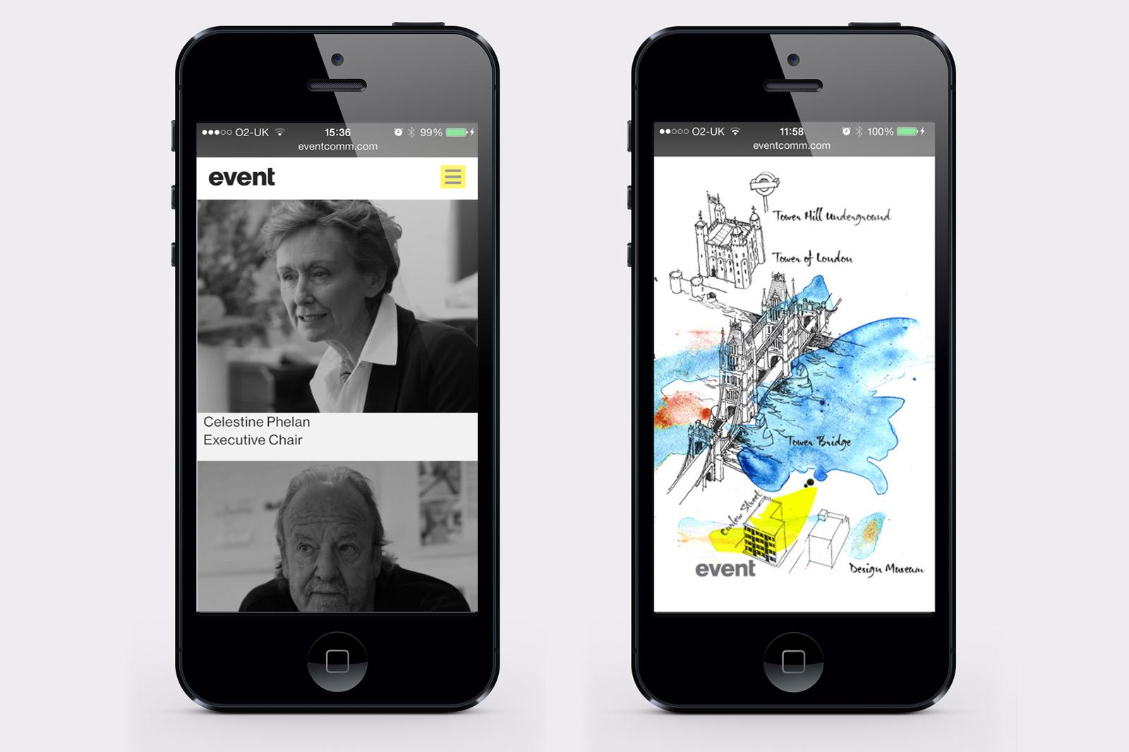
A ‘simple to browse and search for projects’ grid based responsive site was designed to showcase their comprehensive ‘portfolio’ of leading exhibition design and strategy over the last twenty years featuring over 100 projects and case studies.
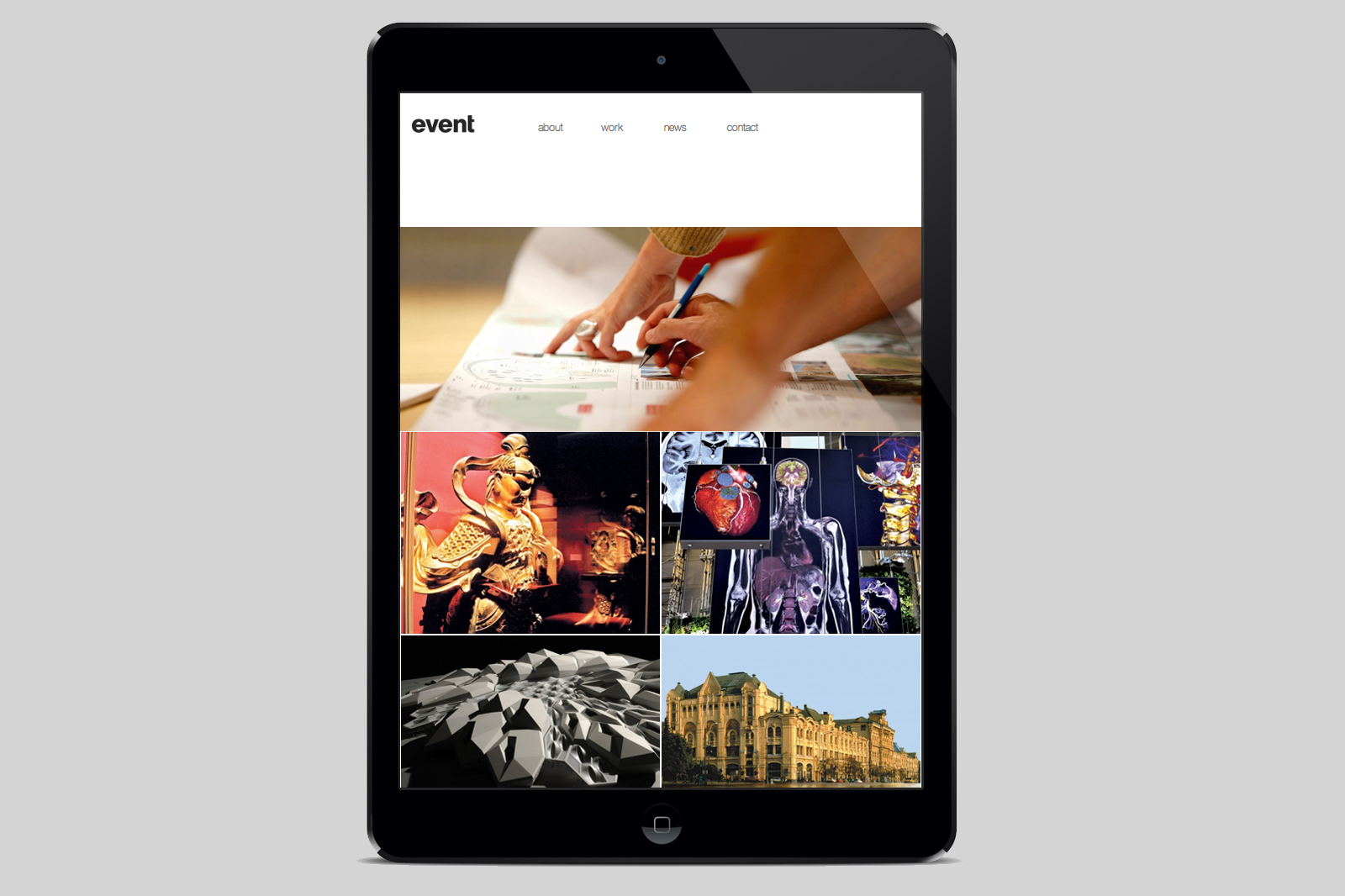
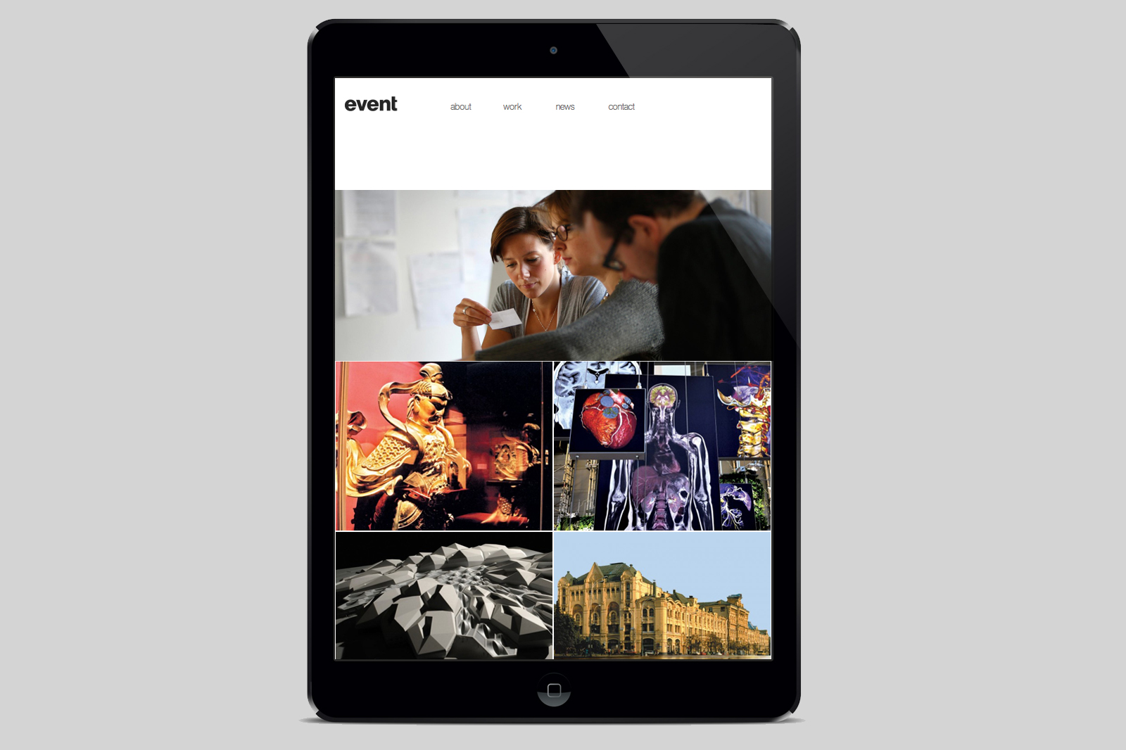
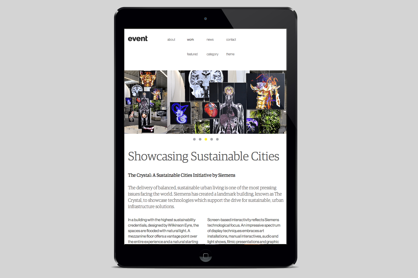
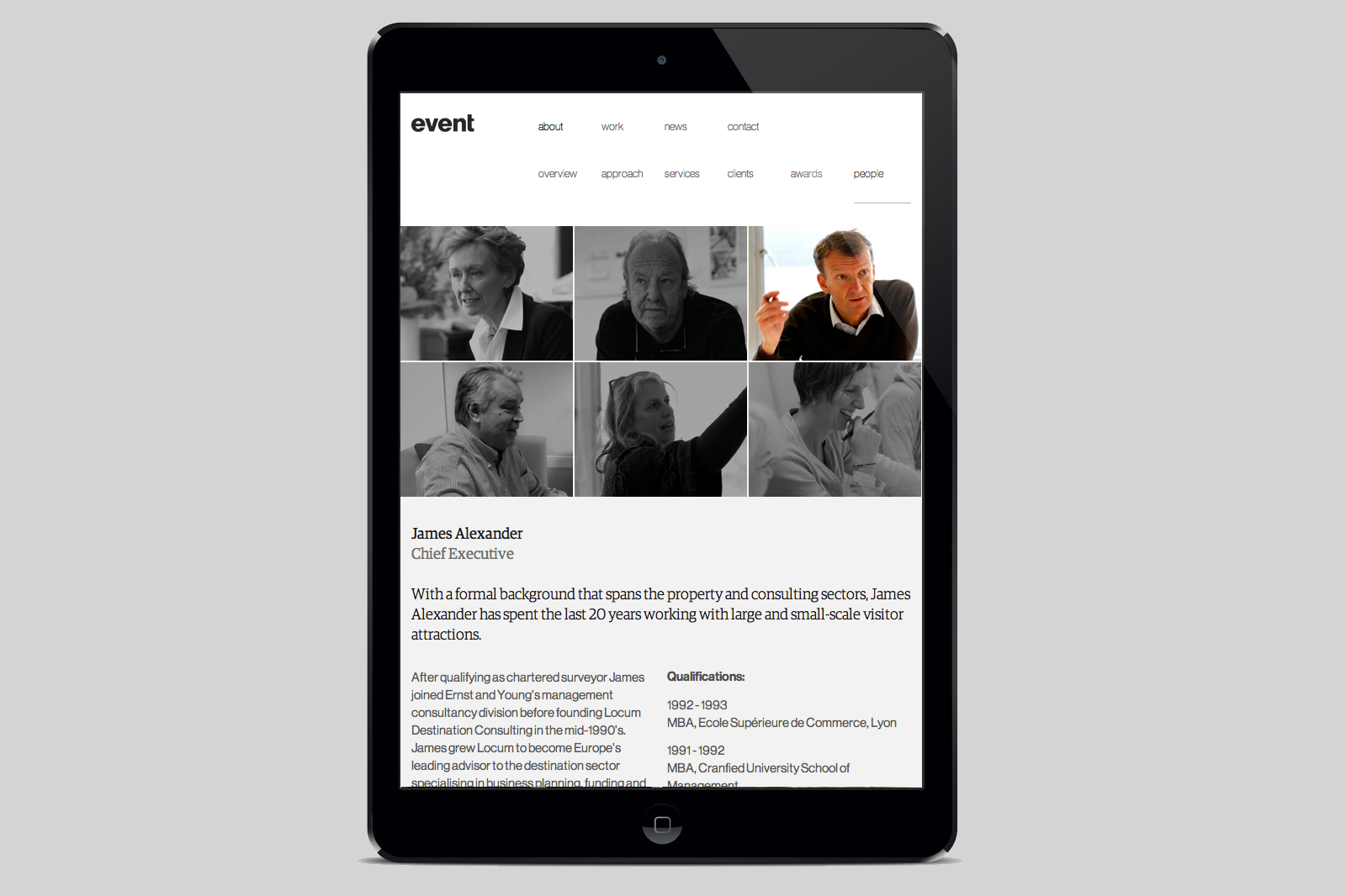
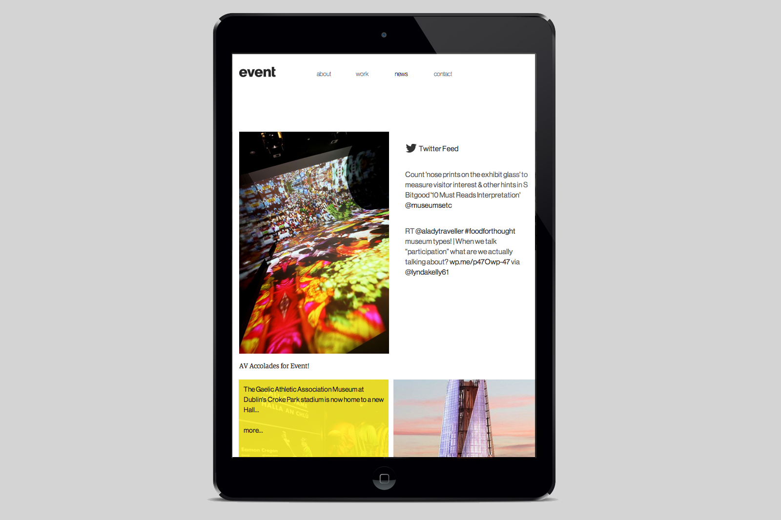
Underlying the initial simple ‘Homepage’ view with only four menu title options — the website has huge depth and content to explore – which was designed to be offer the user choices of searching by either specific ‘Sector’ or ‘Category’.
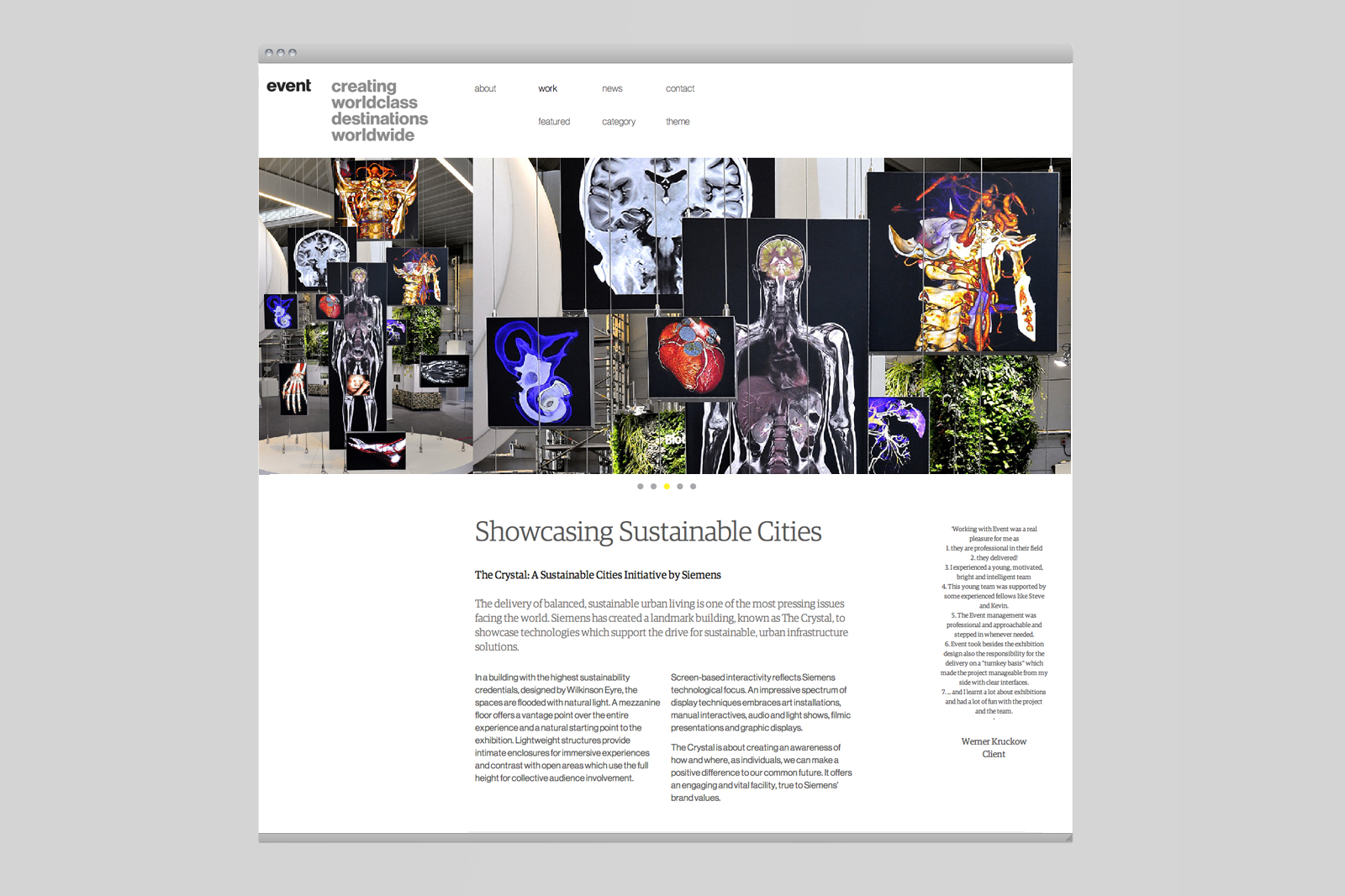
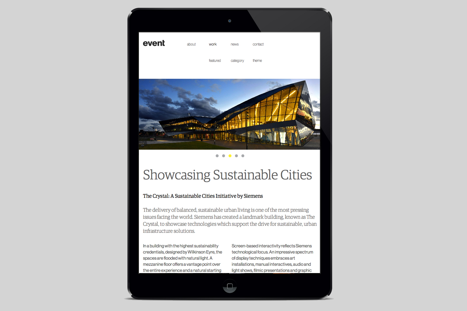
We designed the site to allow large photography slideshows and indepth case study texts and reports.
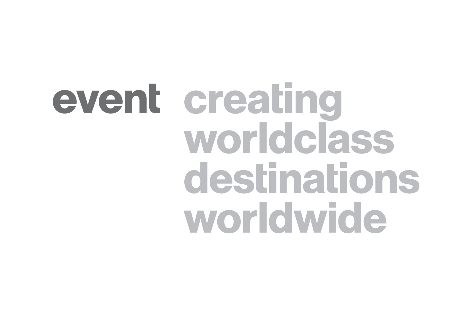
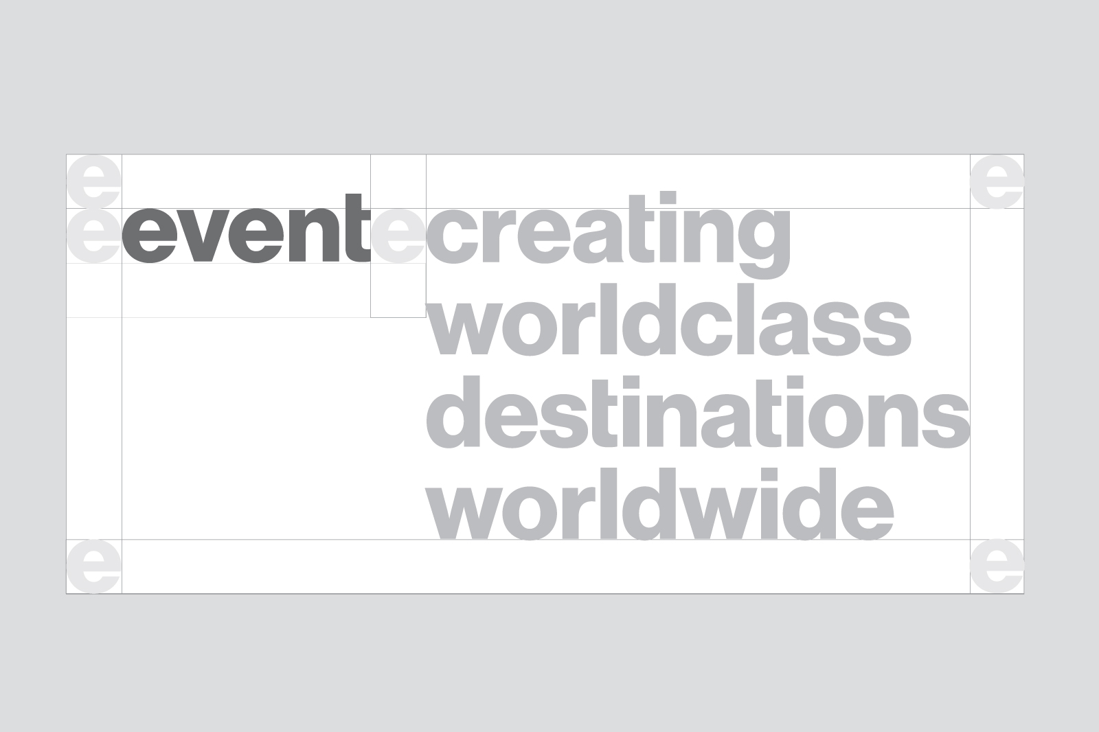
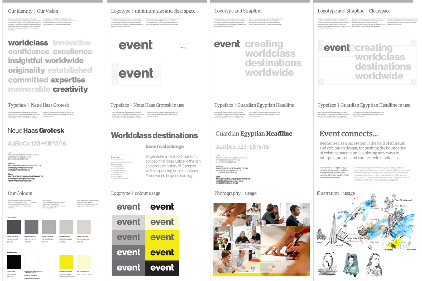
A simple and elegant ‘event’ logotype was handrawn to work alongside an understated yellow and grey colour palette and we introduced Heue Haas Grotesk and Guardian Egyptian typefaces to create a clear and consistent ‘event’ typographic style.
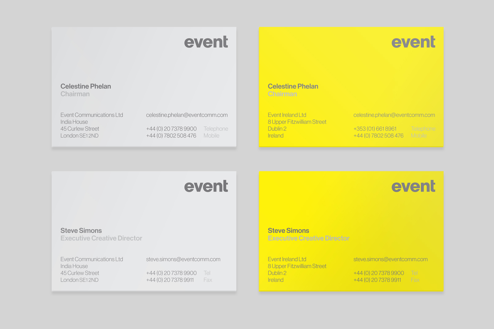
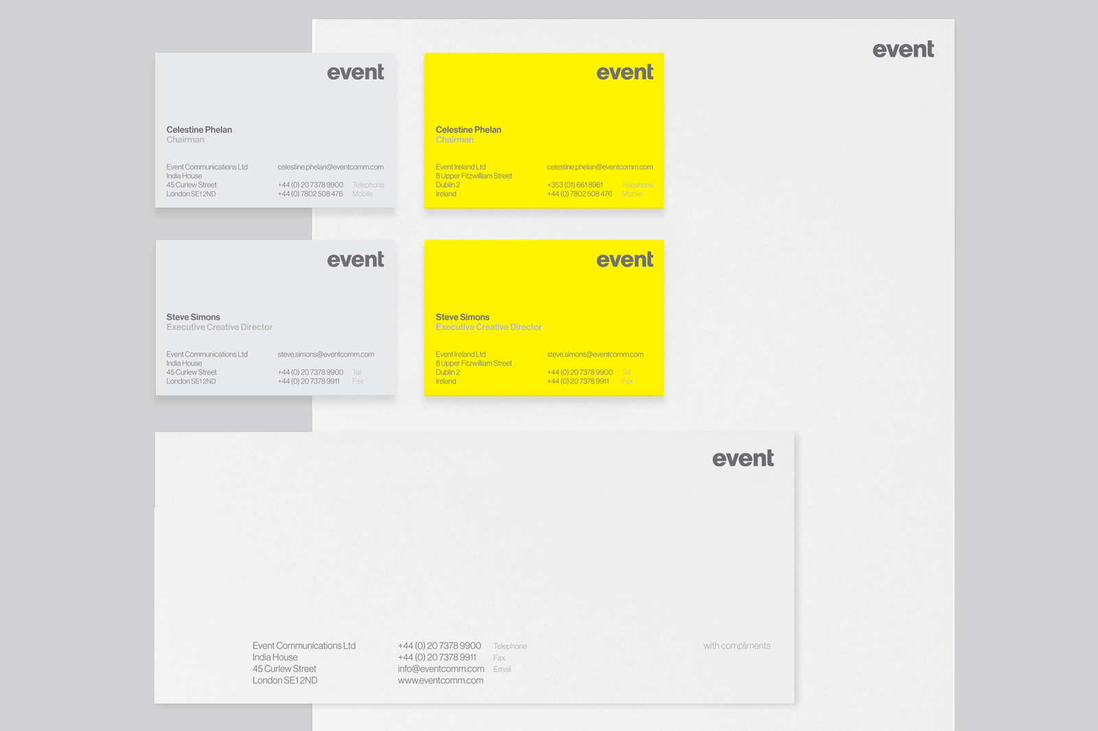
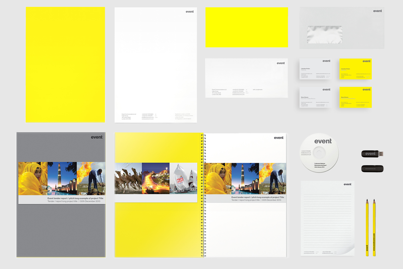
The new brand identity launch was supported by a new suite of event marketing collateral with stronger emphasis on the yellow and grey brand colours in the use of materials and stocks. The strong and confident use of yellow would enable ‘event’ to stand out from competitors in pitch / proposal opportunities and in time become immediately recognisable as an ‘event’ document.
